Showing posts with label traditional decor. Show all posts

Saturday, March 19, 2022

our previous home - the guest room


I can't be the only one who feels that the past year has simultaneously crawled by and passed in a blur? It feels like I finished this room ages ago, and yet, I can hardly believe it's been an entire year, practically to the day. Nevertheless, what a year it's been.

Anyway, regardless of how much time as passed, I'm happy to finally be sharing it with you. I think it's my favourite room to date. 
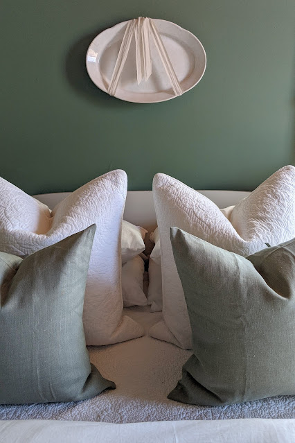
 

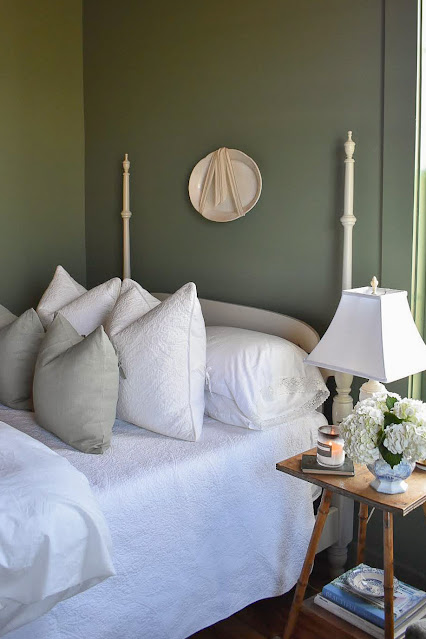
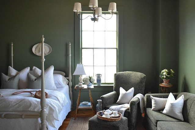
First, and most importantly, the colour. After much consideration, I decided to go with my instincts and actually select a colour I fell in love with - Farrow and Ball's Calke Green. In the past three homes we've owned, I haven't strayed from my usual Simply White. But a guest room is a unique room. I feel like it's a room that needs to be a little more special. And because it was a room that wasn't used each day, I felt like I could go with something a little more bold. It was a room with lovely high ceilings, and two massive original windows, so I felt it carried the colour well. I also felt the green, while natural and still neutral feeling, was also serene and inviting. I decided to paint the window frames and all the trim work to match the walls, and in my opinion, this is what makes the room. It adds a richness to the space and it feels more historic. I also painting the cabinet and the bed frame Farrow and Ball's Old White which works beautifully with the green, without feeling stark.
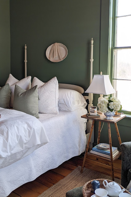

The green reads slightly more sage and a bit darker in this lighting, but you can get an idea of it's vibrancy in the window sills.
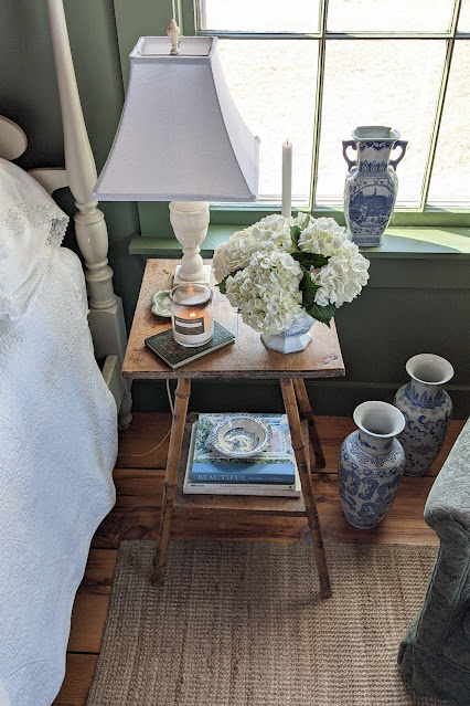

I am still absolutely in love with it and I plan to use the colour again (or one of a similar tone) in our new house. I love how it feels with the warm natural woods, and I love how the blue and white looks against it.


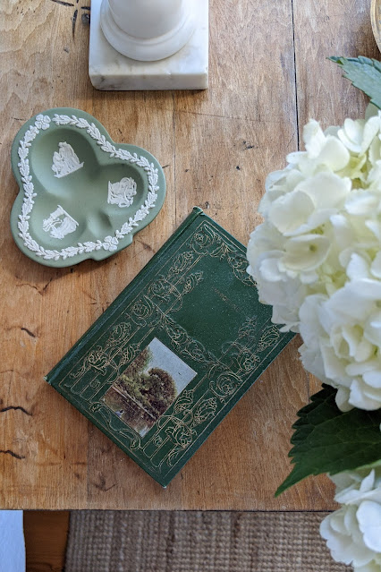

I'm not surprised I settled on green. When I started looking at some of the pieces I had collected, it was clear there was an underlying theme. 
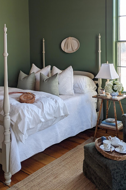

When thinking through the layout, and how I wanted the space to be used, I decided it needed not just a sleeping area, but a sitting area as well. I wanted it to be a retreat for our guests - a room not just to retire to, but their own space in our home where they could get away and read, or spend some time alone.


Every piece of furniture in this space was something we had previously had. The sofa and chair set belonged to my inlaws. In fact, it they used it for about 40 years of their married life. I always liked the green damask, and was happy to use it in this space.

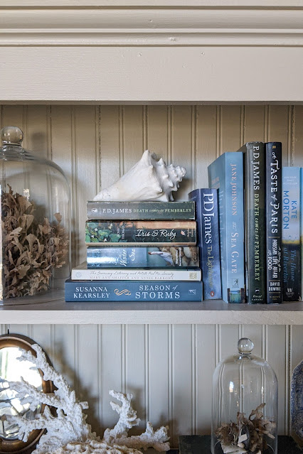

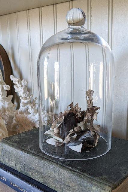

To give the space some character, I started collecting things to display - little things found while beach combing, old books of historic significance, all the rusty treasures we dug up while gardening. These are the things that add depth to a room.


Then I added things that would make a stay more enjoyable. A collection of some of our favourite videos,  baby items, candles, fresh flowers on the night table and lots of extra linens and pillows.


I like having a lighter quilt on the bed with the option of a heavier, warmer duvet, as well as both firmer and softer pillows.
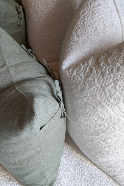

With travel restrictions, we didn't have many opportunities to use the room before we sold the house, but we did find ourselves occasionally sneaking into it to quietly read and enjoy some quiet. And while I do miss the room, I now have an entire little guest cottage to plan, so I'm not too heartbroken.

I'm looking forward to sharing more on that space soon.

Friday, March 6, 2020

guest room design board

If you've known me for a while, or followed along for a reasonable amount of time, you would likely know that I have a very strong affinity towards white.

Design wise, it's where I feel safe, and yet based on the inevitable response I get from most people (especially when they know we have four sons), you would think it was the most unsafe selection.

For me, the white I'm drawn to is a very natural white, maybe slightly creamy in the right lighting. This white feels timeless (it is after all a historic white) and it's neither stark nor cold, or even bold for that matter. It's a sort of blank canvas to build off of. To me, it feels uncluttered and airy, it fades into the background. It allows what's layered onto it to be drawn more into focus: the delicate print of a pattern and the patina of a well-worn pine cabinet, with it's age spots and honey hues, are noticed more . There's more freedom in allowing the design to evolve through the seasons - more warmth and texture for winter, pared down and light for summer. As my tastes grow, the space can grow without a complete re-commitment to another colour, which maybe doesn't seem like all that much of a commitment until the time comes to actually repaint.

That's where I find both safety and freedom in it. It's a sort of beautiful irony really. 

Over the years, I've learned to trust what I'm naturally drawn to. I've watched very distinct patterns unfold in the things I find myself gravitating towards. One of those patterns is colour. When I sort through images that I've gathered for inspiration, be them landscapes, table settings, shops, floral arrangements, or furnishings, the same colours reveal themselves. I've noticed that my tastes are very natural - lots of green with some blue, and hints of yellow. As I've grown more confident in my own sense of taste and style, I've begun incorporating these colours more into my design - adding some traditional blue china to my table, mustard-yellow velvet pillows to the couch and always green in potted plants and fresh florals.

When we purchased our new home, I didn't sway from my usual selection of Simply White. Still, a part of me has always wanted to fully indulge my intuitions and furnish a room exactly as I envision it. When we made the decision to make the formal living room of our home a guest room, I found the perfect opportunity to do just that. It would be a room of it's own and I would allow myself carte blanche to furnish it however I desired.

So, where all good projects begin, I'm thrilled to finally be able to share my design board for our guest room with you. Later, I'm share more on how I decided on the colour.

Here is my best attempt at the sources for my inspiration.
Pillows (top left) - @cotswoldsinteriors, Cowlfax and Fowler
Pillow - Accent Marks (Etsy)
Stitched Monogram - emsheart.com
Drapes - Southern Living
Blue Plate - @houseandhistory
Paint Colour - Farrow and Ball
Light - Visual Comfort Lights
Armoire - @pearlonmain
Pillows and Blue China - @sb.sarabartholomew
Painting - @missmustardseed
Blue and White Vase - The Enchanted Home
Exterior Door - unknown via @susaneblakey
Fabric Collection and Inspiration - @nineandsixteen